Last month, Stephanie Evergreen wrote an awesome guest post called “Six Steps to Great Charts” with lots of practical tips for using the Excel chart feature to visualize your social media measurement data. The six steps:
Step 1: Which Chart is Best?
Step 2: Use Color To Emphasize
Step 3: Delete Data You Don’t Need
Step 4: Directly Label
Step 5: Save As A Template
Step 6: Annotate
For step 1, she suggested using Juice Analytics chart chooser tool. I wanted to learn more about what particular chart format is better suited to visualize a particular comparison or insight from social media data. And, can the process of selecting the right chart format help you better understand your data? To help answer those questions, I consulted a classic, “Say It With Charts” written by Gene Zelazny, Director of Visual Communications at McKinsey which is a sort of Strunk and White for graphs and charts and used it to guide creating charts in Excel. Here’s what I learned:
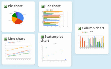
When it comes to charts to display quantitative data, there are only a few basic chart forms to select from. Here’s the different formats and some pointers on when and how to use them for reporting on your social media metrics and data.
Pie chart
Pie Chart: Use a pie chart when you are making a point about the size or percentage of each component compared to a whole. The example of above is the percentage of gender for total audience. Your eye is used to measuring in a clock-wise motion, so you should position the most important segment against the 12 o’clock line. To make the most of pie charts, do not have more than 6 slices. Select the five most important components and make the rest into other. Pie charts are the least practical of the chart forms and most often misused.
Here’s more on how to use pie charts in excel.
As soon as you need to need to compare the components of more than one total, avoid using a pie chart and switch to a bar chart or column graph.
Bar chart

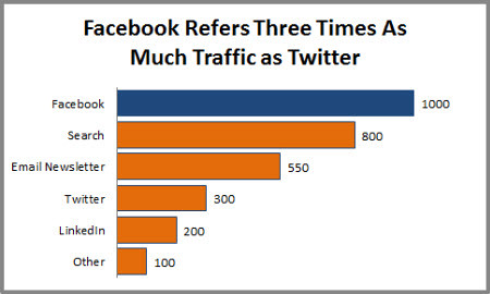
Bar Chart: When you compare different items, use a bar chart. The vertical is used to label and measure different items. In the example above, the bars are measuring the unique number of monthly web visitors from source. You have some choices in how you arrange the bars or items. You could arrange them in alphabetical order, or low to high or high to low (best to worst) as I did above. Think about what order best stresses the point you want to make and make sure you sort your data in excel the right way.
Use can also use color to reinforce the what the data is telling you or the title of the chart. In this example, I made the item with the best traffic referral a different color from the rest, using Facebook blue. I had to use format options in Excel and change the colors of the bars manual. Zelazny also suggests that the space between the bars be smaller than the size of the bars. The default in Excel is to have thin bars with a lot f space. I had to use the editing series option and reduce the “gap width.” Here’s how to do it.
You can add a scale at the top or numbers at the end of the bars, but not both because it adds clutter. Use the scale if all you want is a quick study of relationships, but use the numbers if they are important to your message. Sometimes, you might want to use the scale and the one number that needs emphasis. There are variations on the bar chart that you use in Excel, but these are used for complex data sets. Keep it simple!
More in bar charts in excel.
Time Series Comparisons
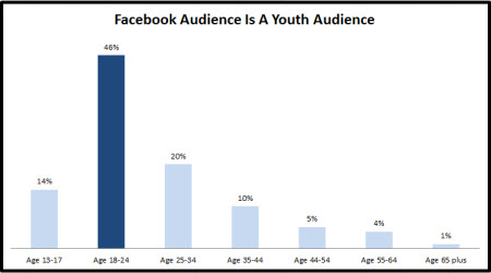
The pie chart and bar chart are used to compare different components with another at one point in time, but you have data that is showing changes over time, you can use a column chart or line chart. Zelazny says that picking between the two forms depends on how many data points you are plotting – fewer use the column chart, more (many years) use the line chart. Also, column chart is best for representing data that “reset” every month and line charts best for cumulative data.
I’ve created two different examples below with some notes about how to maximize each.
Column chart
Column Chart: The chart illustrates click thrus on Twitter to links by month and each month starts over again. The suggestions for making the most of column charts are similar to bar charts.
Line chart
Line Chart: The line chart is one of the most often used of the five charts. It is easiest to understand your data – whether the trend is increasing, decreasing, fluctuating, or remaining the same. It is best used when there is cumulative data, like growth in subscribers, followers, or fans.
Make sure your trend line is bolder or thicker than the horizontal grids, again requires changing the style of the lines in the chart format menu. Grids are there for reference, not dominate visual attention.
The line chart has a variation – the grouped line chart which compares the performance over time of two or more items. The challenge is figuring out how many trend lines you can show before your chart looks like a bowl of pasta. One technique to de-clutter is pair your trend lines, although this requires using more charts.

Column charts and line charts can also be used to comparison of frequency distribution these are called histograms (column) and histographs (line). This shows how many items fall into a series of progressive numerical ranges (distribution). Column charts are used for fewer ranges and line charts more ranges.
One thing I discovered: If approached representing data on a chart as a design process focusing on my key point and using the customization options (color, size, grids, order, title), my charts were vastly improved over the default Excel options. In other words, I used Excel to as a sense-making tool, not just a chart creation tool.
[slideshare id=18652711&doc=annemeryignite-130411233823-phpapp01]
Want to go deeper in charts and graphs in Excel? Here’s a terrific resource from one of my favorite data nerds, Ann Emery. (Hat tip to Susan Chavez)
What are your tips for making sense out of your data?
How do you visualize your social media data in excel?
