Yesterday, I had the honor of kicking off Compasspoint’s Webinar Week, with a webinar on social media measurement 101 as part of my work as Visiting Scholar at the David and Lucile Packard Foundation. To mark Valentine’s Day, I took some inspiration from Elizabeth Barrett Browning and the vintage Valentine’s Day Cards pinterest board to create a presentation about social media measurement love. I tested out the five phases of falling in love with measurement. Given the topic was measurement, I couldn’t help but go a little meta and play with incorporating learning analytics into the instruction. This blog post shares some insights about those two somewhat disconnected ideas.
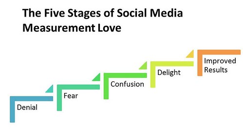
The Five Stages of Social Media Measurement Love

It is always important to look at the challenges of adoption of improving organizational processes or individual skills, especially if they are new. It should always accompany the tips and how tos. That’s why I always start a webinar with a framework for learners to assess where they are and what change is needed (if anything) to embrace a new way of doing something. I presented the five stages of falling in love with measurement. These are:
1. Denial: You can’t measure social media!
2. Fear: What if we find out our social media didn’t perform well!
3. Confusion: I don’t know what or how to measure social media.
4. Delight: Check out these charts and graphs!
5. Measurement Love: Connecting measurement to decision-making and getting better results

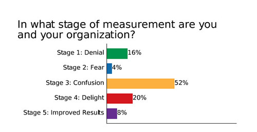
I did a quick user poll for folks to self-asses where they are and then we had a quick discussion in the chat to unpack what each stage looks like and what’s needed to get to the next stage. I was surprised to hear from participants that while they have the practice of measuring other programs, they don’t know how to approach measuring social media. The “fear” stage seems to also go hand in hand with fearing social media in general. Said one participant, “We are in the fear stage because our senior leaders fear social media and we’re not sure we get results with social media.” Many admitted to being in the “delight” stage – that collect data but don’t know how to make sense of it. Those that found themselves at measurement love – using data for decision-making said that it goes hand-in-hand with their organization’s learning culture.
Learning Analytics
I came across the term “Learning Analytics” in an NPR story about the effectiveness of college lectures and ways to make learning more interactive. There are different definitions. Elearning space defines it as: “Use of intelligent data, learner-produced data, and analysis models to discover information and social connections, and to predict and advise on learning.” I took the very simple approach of thinking of it as a data that can help you see the correlation between learning activities and learning outcomes.
The outcome for this webinar was: To leave the webinar ready to take one small step towards improving social media measurement practice.
To do that, participants have to be able to implement that step without being encumbered by the denial, fear, confusion, or delight stages. I took several polls throughout the webinar asking them about their relationship with measurement. Specifically, I wanted to see if the needle moved from hate to love. If I look at the pre and post tests, the “love” measurement increased.
I also used this poll after different sections of content. The polling after the section of content about how to make goals measurable showed that the needled moved slightly in the other direction, towards hating measurement. A follow up question revealed that a big challenge is making goals measurable. This gives me some more insight about how to make teaching this concept more accessible.
This was just a first experiment in trying to use the concept of learning analytics to help improve instructional design. It is something I want to explore in more depth – I know that I’m probably not asking the right questions or perhaps not stating them in the right way. The next step is to formulate questions that relate to the content not learner attitudes.
Bonus: Spreadsheet Appreciation
One of the most important measurement tools for nonprofits is the spreadsheet. In this post, Mashable reviews five free awesome social media spreadsheets. I tested each one. The one I found most useful was #3 because it could be an easy way to compare or benchmark with other organizations. However, the use of a pie chart is a little meaningless – I would change to a bar chart.
Do you think that understanding learner’s attitudes and their organizational context is important when designing instruction on new ways for nonprofits to work? Do you think using learning analytics is of value to helping you improve instructional design? Have you used learning analytics? Please leave a comment.
