Most of think about infographics as part of our marketing and communications tool box. Therefore, we want an end product that looks good, professional, and captures attention and if we lack graphic design chops we turn to in-house graphic designers or hire professional designers.. I couldn’t agree more!
But there is another reason to consider “DIY” infographics – as a sense-making technique. My personal rule in measurement is to spend 30% collecting and organizing data and 70% thinking about what it means. For me, I need to see patterns and link it back to strategy and tactics. And, there is no better way consolidate your insights by expressing them as DIY infographic.
Okay, now you’re probably getting stressed out thinking about today’s to do list, that report you have to write, and a day scheduled with back-to-back meetings – and probably think it takes days to create an infographic. It doesn’t have to be that way. You don’t have to be the world’s best artist to create a respectable infographic to help you make sense of your data, but it does take a little consideration and small amount of inspiration. In “The Power of Infographics” Mark Smickilas offers some good recipes for creating your own infographics. You need to start with data, audience, and time allocation. For inspiration, check out this Pinboard of nonprofit infographics which will lead you to many more examples. Now, comes the perspiration part.
Yes, the process of creating your own information design is straightforward but you need to invest some energy learning about design fundamentals and honing your visual thinking skills. And then there is mastering the tools. I’ve been looking for free, low cost, easy-to-master tools and templates to reduce some of the sweating. Here they are:
1. Microsoft PowerPoint or Publisher: Both of these old standards have layout tools that make it easy to compose your infographic (and export the final product as a graphic image). I like the Smart Art templates to help me see patterns in my data. Hubspot just published this awesome collection of infographic templates for Powerpoint. And, ironically, the templates are just pretty, but they help guide you in planning and designing your infographic. Take this template that helps you think about how to use color and chunk your information. The infographic (it’s a snippet – click through to see whole thing) on oral health was created in publisher with clip art.
2. Clip Art: There’s a lot of clip art around, although a lot of it is ugly. One of my favorite resources is The Noun Project which is a visual language site that collects and organizes symbols and icons for public use. It has tons of icons that are easily searched by keyword and you can share your own. Most are in the public domain.
3. Know Your Charts and Graphs: Some infographic templates come with charts, but it is useful to take a quick tutorial about knowing what type of chart is best to represent what type of data. After helping my kids with math homework (they had to represent some data in a chart), I found this awesome, free chart maker at the National Center for Education Statistics. But the bonus was the tutorial to help you better understand and apply charts. If you remember your 6th grade math and science, you might want to skip the tutorial and check out the online chart tool (I love the meter charts). These free tools will save you time, but you don’t have complete control over look and feel.
Then I discovered Chartwell Fonts. This font lets you take simple strings of numbers and transform them into charts. The visualized data remains editable, allowing for hassle-free updates and styling. You have to slow down to create the charts and you really how to think about you want to present your data. When you use automated excel or survey monkey charts, it encourages you to skip that important step. While it took 20 minutes longer to create these from scratch, it forced me to really think about the data and it generated additional insights. That’s the most important thing to me, anyway.

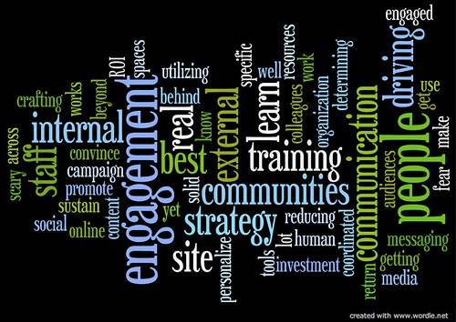
Most of the time you’ll be making charts and graphs of numerical data, but some of your data may be a content analysis or theme analysis – and you can use word clouds to illustrate the frequency of a particular theme. My favorite free tool for doing that is Wordle
4. DIY Infographic Tool Suites: There are tool suites out there that combine all of the above into one package. One of the best apps is Canva which comes with infographic templates. One of the popular ones is PiktoChart which has a free version. There are scores of free, low cost, and expensive tools to create your own infographics.
Honestly, for me it was less time consuming to use simple tools because I could focus more on what the data means vs trying to figure out a particular tool works. I think once I hone my DIY infographic skills for sense-making so they are second nature, then I might need to upgrade my tool box.
Are you using DYI infographics to make sense of your data or part of your marketing tool box? What are your favorite tools? How are you honing your visual thinking and sense-making skills?
