Infographics, if done well, can be a useful way to boil down key principles, ideas, or themes. They’re gaining popularity everywhere, including the nonprofit sector. More and more nonprofits are starting to use them and it isn’t difficult to find lots of examples and curate them.
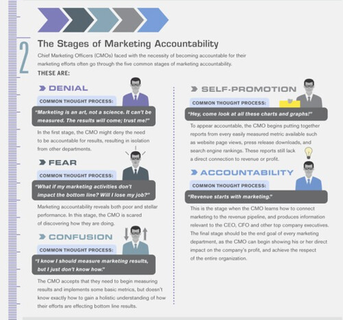
KD Paine, my co-author of the Measuring the Networked Nonprofit (due out in later in 2012), pointed me to this gem of a measurement checklist in an infographic format. I like the positive frame they put on measurement malaise and the hat tip to Kobler-Ross.
1. Denial: You can’t measure it
2. Fear: What if we find out our social media didn’t perform well
3. Confusion: I don’t know how to measure
4. Promotion: Check out these charts and graphs!
5. Accountability: Connecting measurement to decision-making and getting better results
Where do you sit along the spectrum?
Beth Kanter is a consultant, author, influencer. virtual trainer & nonprofit innovator in digital transformation & workplace wellbeing.

Leave a Reply