How do you measure your network to learn how to improve outcomes? That was one of many questions raised at during a Twitter Chat last week around the #sm_re hashtag. The chat was a prelude to a convening on April 25th at the Robert Wood Johnston Foundation of 40 thinkers and practitioners, bringing diverse perspectives and expertise into discussions to develop measures for evaluating the impact of social media on philanthropic outcomes. I’ll be participating in the session, as part of the context setting by giving an overview of themes in my book, “Measuring the Networked Nonprofit,” co-author with measurement guru KD Paine.
The chat, moderated by Kami Huyse, and included RWJF staff Debra Joy Perez (@djoyperez), assistant vice president, Research and Evaluation, and Tina Kauh(@tinakauh), program officer, Research and Evaluation, covered some stimulating questions. Here’s a curated transcript of the chat that I pulled together. But for this post, I’d like to dig into one of the questions, “How do you measure your network so you know if it is growing stronger?”
This is a question that is hard to answer in a Tweet or two, and in fact we devoted to an entire chapter to the topic in the book – “Understanding, Visualizing, and Improving Networks.” Of course, with anything you measure, you have to determine what your goals and success means:
Important to think about network goals, and what being a network member means #SM_RE
— Victoria Dougherty (@VJDConsulting) April 18, 2013
Once this is established, along with goals – the methodology to measure your network relies on having a baseline methodology and using Social Network Analysis. The latter can be a very geeky topic, requiring expertise in statistics, understanding social network analysis terminology, and hard to master software. That often intimidates nonprofit folks (including me), but it doesn’t have to be that way. There are low tech tools and online (low cost or free) SNA tools and great resources like Marc Smith at NodeXL
I’ve been teaching workshops, training other trainers, and developing curriculum on “networked nonprofits,” literally around the world, and one of the first topics we address is understanding your network. This comes from my first book, “The Networked Nonprofit,” co-authored with Alison Fine. Understanding and mapping your network is one of the indicators in my “Crawl Walk Run Fly” maturity of practice model and looks something like this:
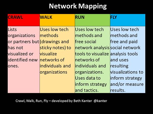
I use low tech tools first – paper, markers, sticky notes, and sticky dots. Participants spend time working together to draw their networks — people and organizations who are important to reaching their organization’s outcomes. They are asked to visualize the relationships – and who players are both online and offline. I also ask them to identify people who are “hubs” – those with lots of connections and those on the “edge” or could be a bridge to new connections. Also to show the relationships to different clusters (related people or organizations) and nodes (a person or organization).
Here’s a collection of network maps from a couple of recent workshops – and you can see how they use color to show differences as well as different types of lines to show the relationships.
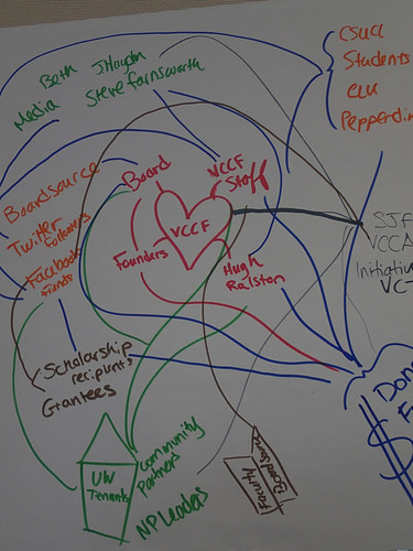
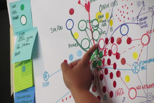
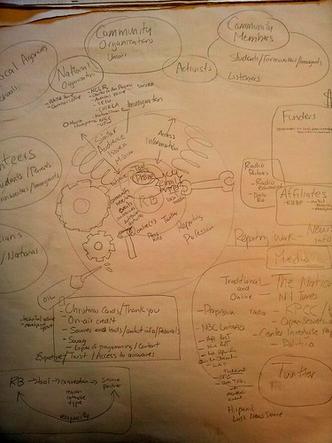
The last drawing/map is from a peer learning group of Packard Grantees that I am facilitating based on “Measuring the Networked Nonprofit,” from Radio Bilingue. Since the goal is for participants to learn and adopt these practices, they are given “recipes” to do the mapping and then share with colleagues.
Once participants do a low tech drawing, we move to explore some of the online mapping and SNA tools to visualize online networks. The map above is a visualization of the Community Foundation of Monterey Twitter following using TwitterMap. It is also a fun way to visualize your Twitter network – and there are some great free apps to do that.
NodeXL and Marc Smith
In 2009, I was lucky enough to take a social network analysis workshop using a SNA free plugin for excel called NodeXL with Marc Smith, a sociologist specializing in the social organization of online communities and computer mediated interaction. (I wrote about it here). He has set up the NodeXL gallery that is collecting visualizations of different networks online using the tool, especially social network maps of people tweeting with a particular hashtag. For example, he ran a map of the #gpf13 hashtag that illustrates the network talking about unlocking data in philanthropy. Marc did a map of the Twitter hashtag for #sm_re (see first image above) and got on Skype to discuss it how one might use a network visualization as a way to measure the strength of a network.
[slideshare id=17396442&doc=2013-smrf-nodexl-sna-socialmedia-130320011951-phpapp01]
In order to really understand the social network map of people tweeting the #sm_re hashtag during the chat earlier this week, one has to look at it in context. The map above depicts everyone who was tweeting during the Tweet Chat. Let’s imagine for a second that this chat was the beginning activity around forming a network to spread best practices about social media measurement in advance of the meeting next week, and maybe might include other activities. For all intents and purposes, this could be the “baseline” depiction of the network. The next steps would be to get “snapshots” of the network during activities along the way and look at how the network has evolved and changed.
The missing link is understanding what patterns in the network mean – and how those are interpreted against the network goals – in this made up scenario – to spread best practices and knowledge around social media measurement for philanthropic outcomes. With me?
Marc shared his expert knowledge and here are some notes.
What is the shape of the network mean?
Marc showed the slide above that illustrates the different shapes of networks. The #sm_re network is shaped like an “in group” or a community. Where folks are well connected to each other and there are pockets of nodes on the edge, etc. The other patterns illustrate different variables such as whether the hubs are just broadcasting their tweets vs engaging and responding – and whether or not there is just a relationship between the hub and the nodes or whether the nodes are talking with one another. The overall shape of the network could, perhaps be mapped to a specific outcome or result.
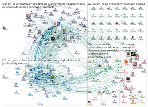
What do we see in this #sm_re map?
You can find a description of the details of the map here, but two top line observations: There are hubs and islands.
Hubs: The sunburst shapes are hubs. These are people or organizations that are strongly connected within a network. If you look at the map of people tweeting the hashtag, #sm_re – there are two big hubs. These are G1 and G2. There are two smaller hubs G4 and G5. The overall donut or galaxy shape means that these people are a community around the subject-matter and may be linked in other networks or communities.
Islands: These are the Twitter users who are not connected to others or the Hubs. Sometimes these are referred to the “edge” or “periphery” of a network – people not well connected to the network or “weak ties.” These are arranged in military style in G3.
One SNA concept that Marc shared comes from Ron Burt and it is about “Bridging VS Bonding Social Capital.” So one strategy is to look for places where people are not connected to one another and make a connection. This is a role for hubs or perhaps “network weavers.” Making connections strengthens the network bonding, but it is also paradoxical. If you become too much of a tight knit network, then it can lead to stagnation because you are not bringing in new ideas or people.
The map can help us hone the practices we use on Twitter for building the network and perhaps help improve the outcomes as illustrated in this slide from Marc’s presentation.
Social network analysis maps are useful for helping you understand your network, developing a baseline visual, and identifying strategies for making your network stronger.
Have you mapped your network? What did you learn? What tools did you use?
