I’ve been facilitating a peer learning group with Packard Foundation grantees during the past year with a goal of improving measurement practice for social media and based on my book, “Measuring the Networked Nonprofit.” Each organization is working on an action learning project that is a small, doable measurement project that applies the frameworks and steps in the book. Each month, we go deep into a practice step – both on the individual practitioner level as well as the organizational practice level. As the facilitator and SME, I provide some content, but participants do a lot of sharing and presenting as well. This helps spread good practices.
This group started the process with doing the hard work of identifying success and key performance indicators, but applying a organizational process to get everyone on the same page and reporting back. Once settled, we took deep dives into understanding how to collect, analyze, and visualize data to apply to better decision-making. The spreadsheet above is from the Community Foundation of Santa Cruz County for an action learning project that focused on measuring the results of the recently launched blog.
On a call last month, participants shared examples of their measurement tools and spreadsheets. Another participant, Compass,also working on measuring their blog, shared their spreadsheet for tracking similar indicators. This inspired the team over at the Community Foundation of Santa Cruz County – even though their organizations are vastly different. They adapted Liz Neeley from Compass’s spreadsheet! They collected the data and now were ready to set up their dashboard.
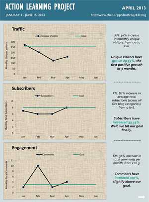
On this month’s call, we focused on the sense-making process, which I’ll describe more below. But, the Luis Chabolla and Kim East were ready now to customized an Excel Spreadsheet to serve as their reporting dashboard. (See above). They worked with their web site designer/developer, Embolden, to identify what data they needed from Google Analytics and created the above simple dashboard. One of the topics the peer learning group took a deep dive into was selecting the right chart and techniques offered by nonprofit data nerds Stephanie Evergreen (who write a guest post on how to create great graphs) and Anne Emery’s tips on how to avoid boring bar charts.
What I always love about peer learning approaches is that we slow down, take it in small steps, and begin to build good practices. These small steps add up to good, hopefully sustainable organizational habits over time.
[slideshare id=22150817&doc=slideshare-howdoisayitwithcharts-130529143823-phpapp02]
The second thing that I really enjoy about facilitating peer learning is that I learn along with the group. As you’ll see in the deck above, I shared my own little action learning project on how to improve my own data using Excel and Ann and Stephanie’s advice. The session was devoted to sense-making.
Sense-Making: Organizational Indicators
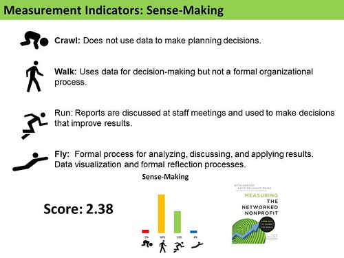
My Crawl, Walk, Run, Fly assessment has an indicator for the sense-making part of the measurement process. This is an organizational level of practice. But we also looked at sense-making from a practitioner level because most people in the peer group are either doing this work themselves or managing someone who is. You need both the skills and organizational level of practice to see a transformational change in the organization as a result of the capacity building program.
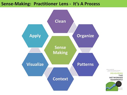
I enjoyed breaking down each step of the sense-making process because for some this is the mysterious part of the measurement process. The participants has a selection of resources to draw from for each step or just an overview – so they could go as deep as they wanted.
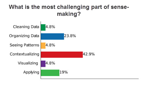
We then has a very thoughtful discussion about what part of the process was a challenge and where they feel they are doing a terrific job. One theme that popped up was that good sense-making happens at the organizational level when you have your team or others in your organization look at results.
I think sense-making is my favorite part of the measurement process, even though it can be difficult. And I love facilitating, designing, and delivering workshops on this topic!
What do you find easy in terms of sense-making of your data? What do you find to be a challenge?
Beth Kanter is a consultant, author, influencer. virtual trainer & nonprofit innovator in digital transformation & workplace wellbeing.
