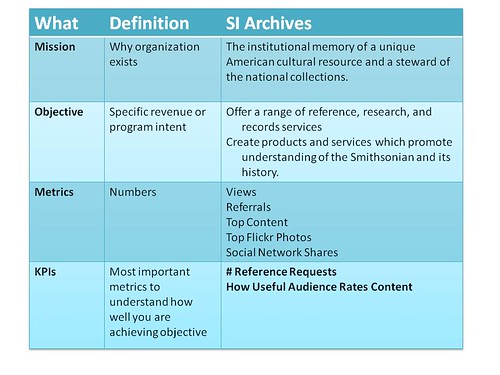
Note from Beth: After a brief conversation about new ways to access web-based “visitors” in the comments section of a recent blog post on dashboards, Dan generously offer to write a post about developing an in-house dashboard as part of his work at the Smithsonian Institution Archives. The post provides some great recommendations on dashboard design, but also illustrates how to link your objectives, metrics, and KPIs to dashboard design.
Guest Post: The Smithsonian Institution Archives Dashboard by C. Daniel Chase
When developing a dashboard, it’s helpful to clarify the concepts and purpose of it from the narrower perspective of non-profits utilizing social media. Our team identified what our dashboard should to do for us:
Provide a summary of detailed data, at a glance
Highlight the important insights that can provide focus for management.
Provide feedback over time
It’s All About A Few Key Metrics, Not Data Overload

Dashboards should not share every single data point being collected, but only the “Key Performance Metrics.” These are developed by considering the organization’s metrics, program intent or revenue goals, looking a list of current metrics, and selecting the most critical that can tell you if you’re “pushing the needle.” The Smithsonian Institution Archives using social media to support two core areas of the mission:
Offering a range of reference, research, and records services; and creating products and services which promote understanding of the Smithsonian and its history.
Tracking what content is utilized, and the services rendered provide a means of measuring our success in achieving that mission. These become the metrics & KPIs behind our work.
Our KPIs are Reference Requests (how many queries for additional information about the Archives’ collections we receive from Smithsonian employees, outside researchers and the general public) and our ratings about the usefulness of our content. These serve as indicators of how well we are serving our audiences. The first by demonstrating our goal of making Archives resources accessible and used; and the second serving as a broader indicator of how useful people find our new content, information, advice and outreach, most of which resides on our blog.
Keep It Simple
We all know the extreme amount of data available can be overwhelming if you try to review and use it all. Remember, your analytic tools are just a source of data; most are simply designed to display it in a very, “raw,” form. Dashboards are best when they summarize information with the intent of focusing on the questions:
Is there a problem I need to react to, or is everything running smoothly?
Is what we are doing working?
What isn’t working?
Are we spending our efforts/money on the right things?
Using the Dashboard for Decision-Making
The ultimate success of a dashboard is whether you actually look and make decisions from the data. That’s an important part of the design process. At the SIA, we have monthly reports and meetings to review the numbers, as well as the specific content that is doing well—or not. As we move forward with our web redesign, and adding more automation for collecting the numbers, we are planning on doing a quarterly deeper review of ‘what’s working.”
Dashboard Data Collection Automation Design Process
At the Smithsonian Institution Archives, we developed an application in order to ease data collection and reporting of metrics from multiple sources. The application uses Application Programming Interface (API) to retrieve the raw data directly from the sources, capture and store this locally, and summarize according to our KPIs for senior management and a variety of other detailed reports for Web and social media staff.
The very first source of data we wanted to capture was the activity on the Archives’ Flickr Commons account since data was lost after 28 days! We had been spending significant amount of time monitoring this account to see if what we were doing made and impact by manually capturing monthly data in a spreadsheet. We started with Flickr since we wanted to resolve that data loss problem quickly as possible. Remember the third point above, Dashboards should: Provide feedback over time. No data, no feedback. We now have 141 days of data and growing.
As we have been also working on a soon-to-be-launched web redesign and outreach plan at the Archives, we have also been working out long-term plans for creating benchmark measurements of our current sites and comparing these against our multiple social media sites and new website moving forward. This includes merging data from our participation in Flickr Commons, our blog The Bigger Picture, YouTube channel, as well as the Smithsonian Institution Archives website for the Smithsonian Institution Archives.
We are currently using these data sources:
Google Analytics (export)
WebTrends (Smithsonian-wide)
Google Alerts for keywords (manual tracking of Archives mentions which are tagged in Diggo)
Diigo (all mentions tagged by source, i.e., Facebook, blog, Twitter
Feedburner
PostRank (recently purchased by Google) (spreadsheet export)
Facebook Insights
Manually note information about mentions and promotion for individual blog and Facebook posts using Spreadsheet Aerobics.
Different Dashboard Views for Different Departments and Senior Management
One of the final issues we have begun thinking about is how to get the information we automate for the Smithsonian Institution Archives upstream to management for the Smithsonian Institution as a whole (the Archives is just one of many “units” at the Smithsonian.) Our IT department has developed a dashboard to be used by each unit, which has summary abilities to provide that information to Smithsonian Institution leadership. We don’t want to maintain both separately, so the plan is develop an export of our data in the format of the standardized spreadsheet. We get to automate our part, and still contribute to the wider organization’s summary information.
So, what are we including in the actual dashboard display for our department? It’s all about those Key Performance Indicators (KPIs) that Avinash Kaushik describes so well in Web Analytics 101. For our purposes, we are using several metrics:
Referrals from specific sources
Page views for each key area of the new web site
Top images on Flickr
Top pages in blog
Top web site pages overall (blog is integrated in new site)
Shares (Facebook, Twitter, etc.)
Subscriptions / Followers
The detail items in the other metrics provide us feedback on what content is driving our KPIs. What are we doing well, and what could we do better. Keep you eyes on the prize, your KPIs. They are telling you how well you are meeting your goals, which support your institutional objectives.
Institutional objectives lead to Goals, which need Key Performance Indicators (KPIs) to measure. What are your KPIs?
C. Daniel Chase is a Web Developer with the Smithsonian Institution Archives supporting multiple web sites, developing custom applications in PHP & Java, converting historic databases to become web accessible and utilizing XML to provide EAD standard Finding Aids for SIA’s resources.
For more on Dashboard design, see Darby Darnit’s excellent post on Web Site Event Dashboards.
