
Last week I participated on a panel on “Data Visualization for Nonprofits: A Picture Is Better Than A 1,000 Words” with Johanna Morariu from Innonet and Brian Kennedy of ChildrenNow. The day of the panel, I published a blog post that shared our slides, wiki, and resources. But the really wonderful thing about the Nonprofit Technology Conference, is that the knowledge capture is superb. Our session was documented in many different ways as described below. Knowledge capture makes it easy to share the learning with others in the community, but as a session designer and speaker – you can also use it to do an “after action” review to help you review the delivery and the content.
Documentation of Session
- Panel Wiki: This is a hub for the panel and includes our session outline, resources, slides, and documentation.
- Graphic Recording:We were lucky to have some terrific documentation of our session, including the above cartoon summarizing the key discussion and points visually by Rob Cottingham thanks to the good folks at Rally
- Text Notes: Every session has volunteer note takers writing notes in a google document. Our session is here.
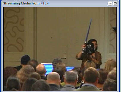
- Video: Our session was lived streamed and we have a video.
- Photos: I rounded up the photos and screen captured important tweets and put them into Flickr here.
- Blog Posts: Wild Woman Fundraising and Wiser Earth wrote session recaps.
- Session Hashtaag Archive: I used rowfeeder to capture the tweets from our session #12ntcviz
This post summarizes how you can use session documentation and reflective practice to improve the content and delivery of your session. Here’s a couple of techniques that I try to use every time I do a workshop, presentation, keynote, or other instruction.

1. What content, lines, or ideas resonated?
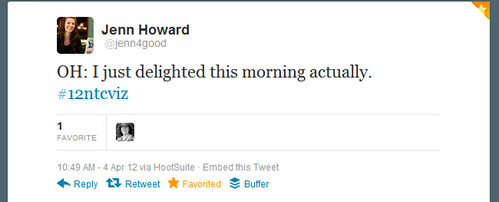
I got through my presentation and look at the Twitter transcript to see what lines or ideas were re-tweeted the most. I use this information to revise my slides for the next time. What’s interesting to me is that lines that I improvised in the moment were the ones that got retweeted the most! The very practical and usable tips resonated. Also humor, especially with props, works.

2. What worked about the audience interaction activities face-to-face?

I always start a panel with a living assessment of the audience to discover their experience, knowledge, and attitudes about the topic to be presented. This helps presenters gauge the audience and figure out whether to dial up or dial down their presentation. (I always design to have the visuals be simple, and adjust my verbal presentation in real time to match audience level). The value of doing an exercise like this is that helps the participants connect with what they already know so they can take in new ideas more easily.
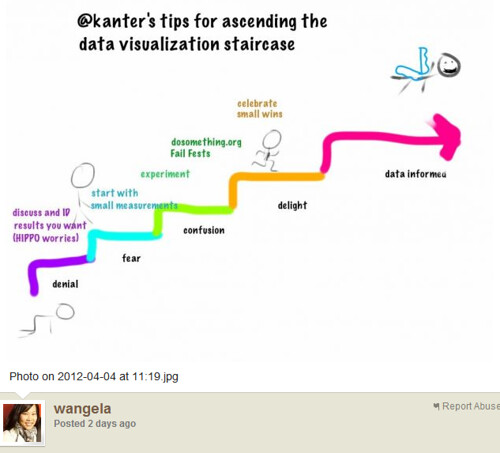
The exercise was to describe a series of stages that nonprofits go through to get to a data-informed culture. I asked for volunteers to “hold a sign” and stand in the front of the room. Then I interviewed them. It was very informative, judging from the conversation and the tweets. One insight is that the denial stage is about the perceived lack of time to collect and analyze data. Many in the audience identified with the “data delight stage.”
3. What was the experience of the online viewers?
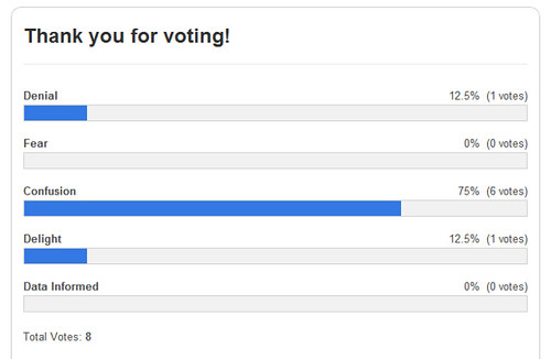
Our session was lived streamed. I had organized parallel online activities that mirror what we were doing the room. For example, for the above exercise, I had the online audience take an online poll.
I have to remember to turn off and on my mic during the audience interaction activities ..
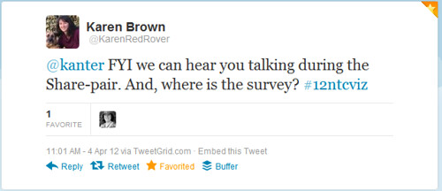
We had an excellent online moderator who was in the room, Ash Shepherd, but the online experience could have been improve with some advanced notice to participants about the online activities. I followed up with some remote participants and asked them about it. Here’s what I learned:
The online experience was good, but could use a little polish. Too many of the sessions had audience interaction that was hard to hear and experience online. The slides didnt always match where the speaker was. As an online session it was also hard when the speaker took too long to get to the meat of the presentation. Many of the speakers took time to “warm up” the audience, which is not as impactful online, especially if we cant hear and see it all. It seemed that the online experience was better when the speaker had more detailed and deeper slides. Also the session that had a more tangible topic seemed to work better, rather than those that were higher level strategy. I think there is a different approach to presenting online versus in person so it doesnt always work well.
I asked for feedback about the hold the sign activity – what was that like for the online audience?
We enjoyed the hold the sign part, it was good to hear from others. The other exercises were tough to follow, but again we didnt look at the session outline online.

I also use a lot of “share pairs” to help people digest the information presented. For the online audience, we asked them to discuss the questions in the chat or on Twitter.
Next year, if my session is streamed, I am going to think through the activities farther in advance and see if there can’t be some advanced communications or perhaps a link added to the online streaming part.
How do you debrief for yourself after a presentation, panel, or workshop?
