• Skip to primary navigation
  • Skip to main content
  • Skip to primary sidebar
  • Skip to footer

Beth Kanter

Beth Kanter is a consultant, author, influencer. virtual trainer & nonprofit innovator in digital transformation & workplace wellbeing.

  • About Beth
    • Awards
    • Profiles
    • Press
    • Books & Projects
  • How Can I Help You?
    • Keynotes & Workshops
    • Training & Facilitation
    • Resources
  • Books & Projects
  • Beth’s Blog
  • TwitterTwitter
  • LinkedIn
  • Instagram
  • CONTACT ME

Data Visualization Techniques for Those Who Can't Draw

May 29, 2012 Filed Under: Measurement

Visual Thinking Presentation for UnitedHealth Innovation Day

View more presentations from burowe

At the NTEN NTC conference this year, I did a session on data visualization for nonprofits called “Picturing Your Data Is Better Than 1000 Numbers” with Johanna Morariu from Innonet and Brian Kennedy of ChildrenNow. Shortly after, I decided to start curating resources on data visualization over at Scoop.It and continue to add the best stuff to the resources section on the session wiki.   In my reflection post about the panel,  I was musing about one of the points raised:  “How Can We Visualize Data If We Can’t Draw?”   This is a common theme for those interested in incorporating visualization techniques.
In a post called, “Data Visualization and Data Art Continuum” the author quotes Stephen Few, a highly regarded data visualization expert:

“There is a distinction between data visualization (“the goal that data be visualized in a way that leads to understanding”) and data art (“visualizations of data that seek primarily to entertain or produce an aesthetic experience”).”

What he means is that there is a difference between eye candy infographics that are not conveying insights – and visualizing data.      There is a tension between art/graphic design skills and visualization of ideas, insights, and concepts.     He comes to the conclusion that: “There is no data visualization without graphic design and no data art without data.”     I think there is a subtle distinction between “visual thinking” and drawing skills.    Visualization of data requires visual thinking to be meaningful and you don’t need to be Picasso to be a good visual thinker and share your ideas in a drawing.
This brings me to the above presentation that I discovered on this blog post, “Visual Thinking at United Health Innovation Day”   There is some really useful advice for those who think because they lack drawing skills, they can’t do data visualization or learn how to think visually.
The major problem or block to using visualization is that many people think drawing is just for artists and if you can’t draw well, than you shouldn’t bother to do it.  That’s an assumption you need to challenge.  It  stops a lot of people from embracing visualization.   It has stopped me in the past.   But I followed the advice of colleague Rachel Smith, who teaches visual thinking and facilitation:   “Send your inner critic who says you can’t draw on a vacation to Hawaii.”
The point that presentation makes is:  Start thinking as drawing as a way to think!
To remove the mental block, it is okay to draw like a cavemen using symbols and low tech short cuts.    Above all, return to your inner 6 year old.   I’m not an artist, but giving myself permission to draw with my magic markers really helped me get past the block.   You also need to learn and practice a visual alphabet.  The two best resources to learn are:  David Sibet’s “Visual Meetings” book and Dan Roam’s Blah Blah Blah: What To Do When Words Don’t Work.    As you practice your visual alphabet, just accept imperfection, practice, and get better.
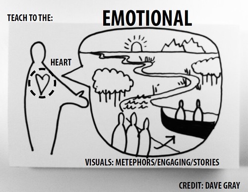
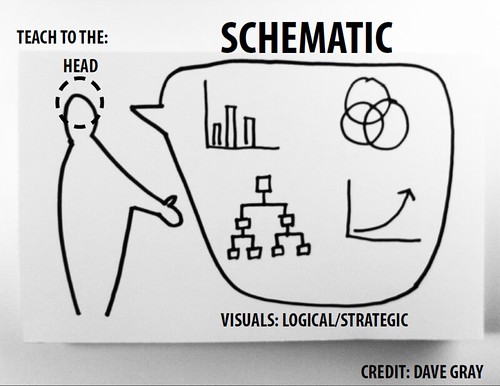
The presentation also notes that it is important match methods to the audience and their learning style.     The styles are: head, heart, and hand.


Another tip was about deciding on the resolution and I think this slide shows that visual thinking can be done with basic drawing skills or more advanced graphic skills.
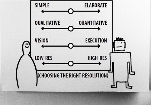
The presentation ends with a great reflective question – why is it that we aren’t using visual thinking techniques in our organizations and our work, is it skills or cultural?    It ends with some recommendations on how to change culture in an organization to embrace visual methods.
Are you using visualization techniques in your nonprofit?  This might be data visualization, visualize facilitation at meetings, or other techniques.   How?


Reader Interactions

Comments

  1. Amanda says

    May 29, 2012 at 6:22 pm

    That was wonderful, thank you so much for sharing! So much good info, looking forward to applying it at work.

  2. Curtis Michelson says

    May 30, 2012 at 7:38 am

    Beth, thanks for posting (or re-posting) this. As a Business Analyst who works on software projects for a variety of organizations, I’m often stupefied why we don’t use more visual approaches to bringing our stakeholders together around key requirements. Thanks.

  3. John Kenyon says

    May 30, 2012 at 8:08 am

    Great post Beth! The cultural change issue is important for folks to think about.
    NTEN is presenting a three part webinar series on data visualization starting June 7th. More info at: http://www.nten.org/events/webinar/2012/06/07/nonprofits-data-worth-1000-words-visualizing-your-data

  4. Beth says

    May 30, 2012 at 10:35 am

    John, going to check it out. Yes, the cultural issue is important -and what we discussed at our panel on the topic (same title too!) It is also an important chapter in my next book, Measuring the Networked Nonprofit.

  5. Mary Cahalane says

    June 18, 2012 at 5:28 pm

    Beth, thank you. I think it’s a GREAT question. I know I have to work things out with a combination of computer and paper… there’s something about the speed of getting ideas out via a keyboard but the tactile, visual work with a pencil or pen that I also seem to need.
    I wondered as I read if something like Simple Diagrams might help people who are a bit drawing shy? (I have absolutely no connection to them, and I do draw and enjoy it myself). But it might help! (http://www.simplediagrams.com/)
    I also think part of the reason we don’t use visual thinking as much may be because art has been downgraded in our schools as an extra, not an integral part of learning. Have you ever met a kid who didn’t love to draw? I haven’t, but somewhere along the line they’re taught it’s not important, or too hard, or something they just don’t do.
    Which is a shame.

Trackbacks

  1. Data Visualization Techniques for Those Who Can't Draw | Complex Insight - Understanding our world | Scoop.it says:
    May 29, 2012 at 12:23 pm

    […] background-position: 50% 0px ; background-color:#222222; background-repeat : no-repeat; } http://www.bethkanter.org – Today, 3:23 […]

  2. Data Visualization Techniques for Those Who Can't Draw | Android tools, techniques and features | Scoop.it says:
    May 30, 2012 at 1:26 am

    […] background-position: 50% 0px ; background-color:#222222; background-repeat : no-repeat; } http://www.bethkanter.org (via @arisso) – Today, 4:26 […]

  3. Visualizing Information Storifies Data And Statistics says:
    June 2, 2012 at 1:41 am

    […] a medium?Related articlesWhen infographics (data art) masquerade as data visualization (elezea.com)Data Visualization Techniques for Those Who Can’t Draw (bethkanter.org)10 Blogs for Infographic Inspiration (inspiredm.com)Selected Data Visualization […]

  4. How To Get Insight From Data Visualization: SHUT UP and SLOW DOWN! » Text To All says:
    June 18, 2012 at 7:02 pm

    […]      This year I’ve been focusing on data visualization and techniques for nonprofits – and working on my visual thinking skills without letting my basic drawing skills become a […]

  5. Does a blank board give you drawer’s block? « eosvision says:
    July 6, 2012 at 6:22 am

    […] May 29th, Beth posted, Data Visualization Techniques for Those Who Can’t Draw.  Beth states, I think there is a subtle distinction between “visual thinking” and drawing […]

Primary Sidebar

Categories

Never miss a post!
Name: 
Your email address:*
Please wait...
Please enter all required fields Click to hide
Correct invalid entries Click to hide
Powered by FeedBlitz

Related Posts

Try Exercise Snacking for Improving #WFH Mental Health

#Fakecommute: A Ritual for Work-Life Balance When You #WFH

New Year’s Rituals for Nonprofits To Improve Resilience in 2021

#AI4Good: Artificial Intelligence & Wellbeing, Ethical Dilemmas, and More

Philgorithms: Two Examples of Data Mapping to Guide Donor Decisions

Future of Giving: Coordination, Donor Retention & Artificial Intelligence

Simple Ways To Reduce Virtual Fatigue for Nonprofit Leaders

Footer

Trainer, Speaker, Author

About Me
Books & Projects
Beth’s Blog
Keynotes & Workshops
Training & Facilitation
Resources

TwitterLinkedInInstagram

Beth Kanter

Copyright © 2021 · by Beth Kanter. All right reserved. Graphic design by Eve Simon Creative. Website development by Cindy Leonard Consulting.