I have been interested in visualization techniques, visual facilitation, and visual thinking since 1991 when I read Tony Buzan’s book, “Using Both Sides of the Brain: Mind Mapping Techniques” that started me down a very slow and leisurely learning journey. This year I’ve been focusing on data visualization and techniques for nonprofits – and working on my visual thinking skills without letting my basic drawing skills become a barrier.
I’ve been a fan of Dan Roam’s work since his book “The Back of the Napkin” in 2008. He was the keynote speaker at the 2012 NTC this year talking about the ideas in his recent book, “Blah Blah Blah: What To Do When Words Don’t Work.” I’ve gone back to his workbook based on his first book to practice and improve visualization skills and thinking as well as drawing.
He has some terrific advice about how to apply visual thinking to your data visualization and to get insights. But first, he simplifies what visual thinking is: Look, See, Imagine, and Show.
Look: What is out there? What am I looking for? What are the limits?
See: What do I see? Have I seen this before? What patterns emerge? What stands out?
Imagine: How can I manipulate the patterns? Can I fill in gaps? Have I seen enough or do I need to look at more?
Show: This is what I saw, this is what I think it means. Is this what I expected or not? When you look at this, do you see the same things?
These are a great set of questions to ask as you look over your data. The steps are:
- Collect your data
- Lay it out where you can really look at it
- Establish the underlying coordinates
- Map the data
- Draw a conclusion
As a trainer, I always do a participant assessment to understand their experience, knowledge, and attitudes related to the topic – for the most part social media and networked nonprofits. I have a survey that allows me to understand the composition of the group in aggregate as well as the maturity of practice levels for each individual participant according to “Crawl, Walk, Run, Fly.” Understanding this, I can adjust and customize the curriculum level and content.
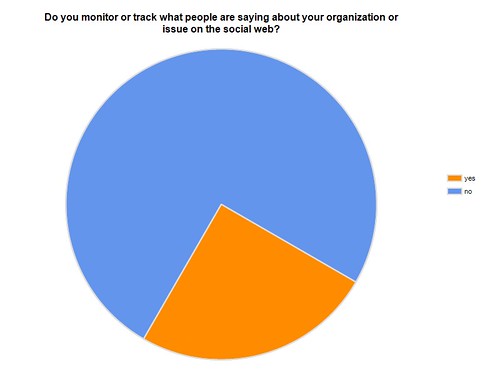
I use survey monkey and grab the visual chart for each question and dumping each chart into its own Powerpoint slide. I thought was done! But I realized that having the visuals for each question on a separate slide did not let me see patterns. I also found the ready-made charts from survey monkey ugly and distracting … but lacking graphic design skills and drawing skills. Then, I caught myself in the negative thinking trap and told myself, “shut up and draw!”
I gave myself 30 minutes, played Mozart on my Ipod and looked at all the data one page. I followed Dan Roam’s steps I did some rough drawings, but I wanted to create more insightful visuals. Then I discovered Chartwell Fonts. This font lets you take simple strings of numbers and transform them into charts. The visualized data remains editable, allowing for hassle-free updates and styling. You have to slow down to create the charts and you really how to think about the “show step.” When you use automated excel or survey monkey charts, it encourages you to skip that important step.
Old Way – Not Visual Thinking – Automatically Create Visual for Every Survey Question on Separate Powerpoint Slide

Better Method: Create Visualizations of Important Data and Pull Together On One Slide
This took some time, but the ability to stretch my visual thinking muscles was worth it. I know understand the process and it took less time the second time it did, and even less the third.
What is your techniques or process visualizing data?
