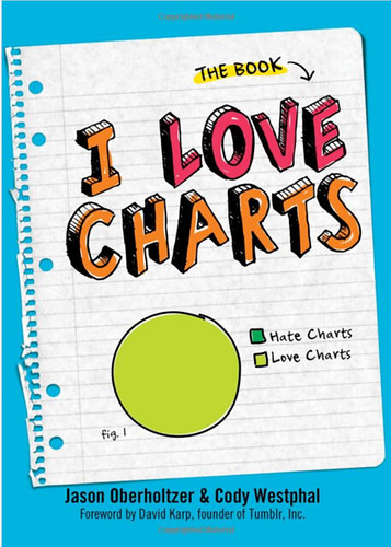
I have a couple of addictions. One of them is magic markers and pens. But I also love using those pens for visualization techniques and especially to sketch out charts and graphs. I did a deep dive on data visualization techniques while working on a chapter of my next book, Measuring the Networked Nonprofit, with co-author KD Paine. That’s when I heard about the book, “I Love Charts.”
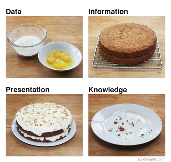
The book is based on the popular tumblr blog with the same name – I Love Charts. The blog has been collecting examples of data visualizations from the hilarious to the useful. One of my favorites is this visualization about the different between data collection and getting insights.

Having the examples in a book as well as following this blog regularly gives you lots of great ideas for how to visualize and present data and ideas. I’ve gotten more than a few good visuals for presentations as well.
It’s definitely one to add to the “Nonprofits Data Visualization Wiki” that I’ve put together to curate and present the best resources for instruction based on ongoing curation over at scoop.it. If you’re looking for tools for creating your own visualizations, I suggest this list of tools: Infographic Tools. If you want some tips on creating your own charts and graphics, see this informative deck from Idealware.
What are your favorite resources for data visualization techniques? How are you using data visualization in your nonprofit’s work?
Beth Kanter is a consultant, author, influencer. virtual trainer & nonprofit innovator in digital transformation & workplace wellbeing.
