Last week, I had the pleasure of doing a Brown Bag Lunch Book Talk for Measuring the Networked Nonprofit hosted by VolunteerMatch at their offices. After the session, I sat down with VolunteerMatch’s President Greg Baldwin to learn more about how they use data, measurement, and learning to measure and improve impact. This is part of my preparation for a session we are doing at next month’s Media Impact Forum, a day long session for funders, technologists, media makers and social change activists to explore innovation, impact, and learning.
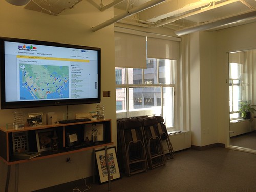
As you get off the elevator at VolunteerMatch, you are greeted by the organization’s real time dashboard, a live visualization of all the activity that is taking place on the VolunteerMatch site. The mesmerizing displays shows a stream of data across a map of the US of all the people currently on the sites searching for a volunteer opportunity that is compelling and irresistible. It is a live data trail of interactions and connections on the site. One might be tempted to pause at this cool display and say so what! But as Greg explains, it is helping to track in real-time the organization’s social impact.
The key performance indicator or data point or metric they are tracking is “referrals.” A referral is when a person connects with a nonprofit for a volunteer opportunity. This is their key metric because their mission is to strengthen communities by making it easier for good causes/nonprofits and good people who want to volunteer to connect with one another. As Greg explains, their key result is for people to volunteer for a nonprofit organization in the real world, not just find the opportunities which is a step in the ladder of engagement. They know that based on the number of referrals that 50% will result in an actual person volunteering. They know from their tracking and research, that the average site user will connect with three or four opportunities before finding the right match. As Greg says, “There is a little bit of a dating process going on.”
They also know from ten years of collecting and making sense of their data the average number of hours the typical volunteer will volunteer for an organization once they are matched (90 hours according to Greg). They use that data point to estimate social/financial impact (# of volunteers x # of hours per year they volunteer x average $ per dollar that is work) which according to Greg was approximately $650 million dollars.
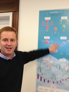
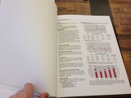
Everywhere you turn in the VolunteerMatch office, there is a dashboard on the wall. The dashboards are cutting edge electronic displays like the real time data dashboard, or the infographic of VolunteerMatch’s annual report from 2011 that is posted right next the elevators. In the waiting area is a hardbound copy of the VolunteerMatch’s quarterly dashboard from the past ten years – and if you look closely at the reports each data point ladders back up to the organization’s mission.
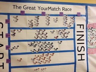
VolunteerMatch is more than just the web site where nonprofits can post their volunteer opportunities, they also work with corporations to provide customized versions of their platform. Another interesting example of data visualization at VolunteerMatch – and a low tech one at that – was this “horse race” showing the migration to a new a version of the software.
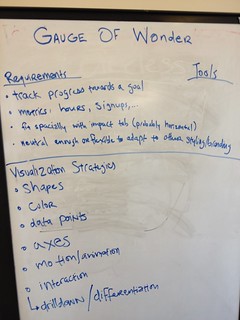
And judging by a peek at the whiteboards in the conference room, planning out and using data visualization to improve programs and measure impact is something that is discussed at regular staff meetings – so it is institutionalized.
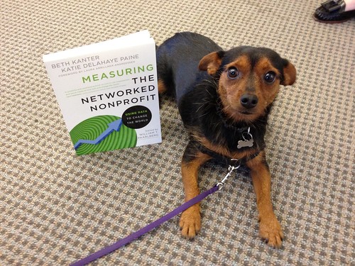
I was, of course, delighted to meet the office dog, “Austin,” who posed with his copy of the Measuring the Networked Nonprofit and have added his photo the collection of famous nonprofit pets posing with the book.
Beth Kanter is a consultant, author, influencer. virtual trainer & nonprofit innovator in digital transformation & workplace wellbeing.
