Nonprofit data nerds will love this new resource from Media Impact Funders and Foundation Center called “Foundation Maps for Media Funding,” a free, interactive mapping and research tool that shows the full scope of philanthropically funded media projects worldwide since 2009.
This version of the tool is a significant upgrade to the tool launched previously by Media Impact Funders. The tool is designed for funders, nonprofits, mission-driven media makers, journalists and philanthropic researchers to analyze funding and investment in the field. You can search and visualize media funding by the following:
- Show Grants By: Explore data for funders (blue) or recipients (orange).
- Location: Global, country, region, state and city.
- Subject Area: View the distribution of a specific organization’s funding by subject areas, including an “and/or” search function.
- More Filters and Advanced Search: Tailor your search by funder type, grant amount, population served, keyword and more.
- Map: Visualize funding by recipient location (orange bubbles) or foundation location (blue bubbles).
- List: View and sort foundation, recipients and grants data in table form. Select details for more grant detail.
- Charts: Compare funding for different activities and display it on a trends chart, bar chart or wind rose (circular bar chart). Click on a line, bar or petal to drill down further and view a grants list.
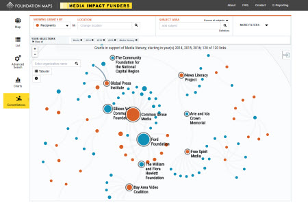
The visualization you are seeing above is a new feature called “Constellations.” This feature lets you generate a network view of funders and recipients to see how funders and grantees are connected by their funding around specific subjects. This like doing a landscape analysis with a simple click!
The term “media” now means so much more than journalism and documentary film. It encompasses a vast array of activities from developing mobile phone apps to launching advocacy campaigns to strengthening the policies and infrastructures involved in media creation, transmission and access. Many projects and organizations that address big hairy problems such as poverty, healthcare access, and others often include a media component.
The data is organized by a revised taxonomy, initially developed in 2013 with support from the Knight Foundation, which now includes five main subjects:
- Media Content and Platforms (previously known as Media Platforms)
- Telecommunications Infrastructure
- Media Applications and Tools
- Media Access and Policy
- Journalism News and Information
Within those there are 25 sub-categories, including radio, film and video, mobile media, media justice, internet access, freedom of expression, investigative journalism, etc.
I find databases that let you search and visualize data fun and highly useful. This specific database has a number of benefits for grantmakers and seekers alike. On the grantmaker side, it allows you to do a systems analysis to see how your funding investment fits into the sector. It can also helps you do a rapid stakeholder analysis. For those seeking grants, it is an excellent way to “follow the money,” or see what types of projects are being funded and learn what other media makers are doing. It can also save you from jumping down the rabbit of hole of writing a proposal to a funder that is not a good fit.
Whether you are seeking or funding media projects or just appreciate really well designed data visualization sites, take some time to explore Foundation Maps for Media Funding.
Leave a Reply